 국립중앙도서관 "우편 복사 서비스"로 연결 됩니다.


 KCI
KCI KISS
KISS
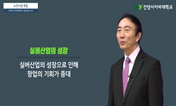
고령화 사회가 급격하게 확산되고 있는 우리나라에서 실버산업은 소비 주체가 노인으로 바뀌어 가고, 사회 전체에 실버산업이 활성화 되고 있다. 특히 실버용품 및 노인을 위한 디자인은 노...
다국어 입력
あ
ぁ
か
が
さ
ざ
た
だ
な
は
ば
ぱ
ま
や
ゃ
ら
わ
ゎ
ん
い
ぃ
き
ぎ
し
じ
ち
ぢ
に
ひ
び
ぴ
み
り
う
ぅ
く
ぐ
す
ず
つ
づ
っ
ぬ
ふ
ぶ
ぷ
む
ゆ
ゅ
る
え
ぇ
け
げ
せ
ぜ
て
で
ね
へ
べ
ぺ
め
れ
お
ぉ
こ
ご
そ
ぞ
と
ど
の
ほ
ぼ
ぽ
も
よ
ょ
ろ
を
ア
ァ
カ
サ
ザ
タ
ダ
ナ
ハ
バ
パ
マ
ヤ
ャ
ラ
ワ
ヮ
ン
イ
ィ
キ
ギ
シ
ジ
チ
ヂ
ニ
ヒ
ビ
ピ
ミ
リ
ウ
ゥ
ク
グ
ス
ズ
ツ
ヅ
ッ
ヌ
フ
ブ
プ
ム
ユ
ュ
ル
エ
ェ
ケ
ゲ
セ
ゼ
テ
デ
ヘ
ベ
ペ
メ
レ
オ
ォ
コ
ゴ
ソ
ゾ
ト
ド
ノ
ホ
ボ
ポ
モ
ヨ
ョ
ロ
ヲ
―
http://chineseinput.net/에서 pinyin(병음)방식으로 중국어를 변환할 수 있습니다.
변환된 중국어를 복사하여 사용하시면 됩니다.
예시)
- 中文 을 입력하시려면 zhongwen을 입력하시고 space를누르시면됩니다.
- 北京 을 입력하시려면 beijing을 입력하시고 space를 누르시면 됩니다.
А
Б
В
Г
Д
Е
Ё
Ж
З
И
Й
К
Л
М
Н
О
П
Р
С
Т
У
Ф
Х
Ц
Ч
Ш
Щ
Ъ
Ы
Ь
Э
Ю
Я
а
б
в
г
д
е
ё
ж
з
и
й
к
л
м
н
о
п
р
с
т
у
ф
х
ц
ч
ш
щ
ъ
ы
ь
э
ю
я
′
″
℃
Å
¢
£
¥
¤
℉
‰
$
%
F
₩
㎕
㎖
㎗
ℓ
㎘
㏄
㎣
㎤
㎥
㎦
㎙
㎚
㎛
㎜
㎝
㎞
㎟
㎠
㎡
㎢
㏊
㎍
㎎
㎏
㏏
㎈
㎉
㏈
㎧
㎨
㎰
㎱
㎲
㎳
㎴
㎵
㎶
㎷
㎸
㎹
㎀
㎁
㎂
㎃
㎄
㎺
㎻
㎽
㎾
㎿
㎐
㎑
㎒
㎓
㎔
Ω
㏀
㏁
㎊
㎋
㎌
㏖
㏅
㎭
㎮
㎯
㏛
㎩
㎪
㎫
㎬
㏝
㏐
㏓
㏃
㏉
㏜
㏆

RISS 인기검색어

노인의 색지각 특성에 따른 3색 배색 연구 = A study on the Three Color Scheme According to the Color Perception Characteristics of the Elderly
한글로보기https://www.riss.kr/link?id=A105718475
- 저자
- 발행기관
- 학술지명
- 권호사항
-
발행연도
2018
-
작성언어
-
-
주제어
3색 배색 ; 노인 ; 색지각 ; 배색이미지스케일 ; three color coloration ; elderly people ; color perception ; image scale
-
등재정보
KCI등재
-
자료형태
학술저널
- 발행기관 URL
-
수록면
658-668(11쪽)
-
KCI 피인용횟수
0
- DOI식별코드
- 제공처
- 소장기관
-
0
상세조회 -
0
다운로드
부가정보
국문 초록 (Abstract)
고령화 사회가 급격하게 확산되고 있는 우리나라에서 실버산업은 소비 주체가 노인으로 바뀌어 가고, 사회 전체에 실버산업이 활성화 되고 있다. 특히 실버용품 및 노인을 위한 디자인은 노인의 시지각적 특징이 반영된 감성적인 접근이 필요한 분야이다. 따라서 본 연구는 실버산업의 한 분야인 실버용품 및 노인의 시각으로 보는 3색배색에 대해 세부적으로 접근하고자 한다. 65세 이상의 노인을 대상으로 만들어진 3색 배색에서 색의 범위와 색조(tone), 배색기법이 어떻게 나타나지는지를 현황조사와 설문조사를 통해 분석하였다. 연구 결과는 다음과 같은 결론을 도출하였다. 첫째, 형용사별 3색 배색은 전체적으로 난색 계열 색상으로 배색하였고, 한색일 경우는 주로 선명한, 밝은 색조(tone)로 구성된 배색들이 많았다. 대부분의 색상배색은 유사색상배색과 반대색상배색으로 색상이나 톤 차이가 명확히 구분이 되는 배색들이 많았다. 둘째, 배색 이미지스케일에서 ‘맑은’ 이미지에서 파랑 색상을 선명하거나 밝은 톤으로 배색하였고, 주황, 노랑 색상은 선명하거나 밝은 톤의 배색으로 중명도/고채도의 난색과 한색을 함께 배색하였다. ‘은은한’, 이미지에서는 주황, 노랑, 초록의 색상으로 고명도/저채도의 밝은 톤과 엷은 톤으로 배색하였다. ‘고상한’이미지는 한색계통의 밝거나, 부드러운, 밝은 회색의 고명도/저채도의 톤으로 배색하는 것을 알 수 있었다. ‘모던한’ 이미지는 유사색상배색과 반대색상배색으로 중명도/고채도의 선명하고, 밝고, 진하고, 어두운 톤으로 배색하는 것을 알 수 있었다. 전체적으로 공통점은 색상배색은 유사색상 배색과 반대색상배색으로 배색하였으며, 중명도/고채도가 많았으며 색조(tone)에서는 아주 어두운 톤보다는 대부분 선명한 톤의 배색과 밝은 톤 배색들이 많았다. 또한 3색 배색에서 가운데 부분은 색상차가 큰 배색들로 선택하는 것을 알 수 있었다. 본 연구는 이 같은 결과를 바탕으로 실버산업 및 실버 용품으로 노인이 사용함에 주체가 되는 색채 연구를 진행함으로써 추후 노인을 위한 색채 계획에 대한 기초적 자료로 효과적인 방법으로 활용될 것으로 기대한다.
다국어 초록 (Multilingual Abstract)
In Korea, where an aging society is spreading rapidly, the silver industry has been turned into an elderly consumer and the silver industry has been activated throughout society. Especially, the design for silver goods and the elderly is a field that ...
In Korea, where an aging society is spreading rapidly, the silver industry has been turned into an elderly consumer and the silver industry has been activated throughout society. Especially, the design for silver goods and the elderly is a field that needs an emotional approach that reflects the visual characteristics of the elderly. Therefore, this study tries to get a closer look at the three-color scheme of silverware, which is one of the fields of the silver industry, and the sight of the elderly. We analyzed the color range, tone, and color scheme in three color schemes for elderly people over 65 years of age using current surveys and surveys. The results of the study are as follows. First, the three - color scheme of the adjective was colored in the color of the overall warm color system. In the case of a single color, the color scheme consisted mainly of a vivid, light tone. Most of the color schemes have many colors that clearly distinguish the color or tone difference with the similar color scheme and the opposite color scheme. Second, in the color image scale, Blue color is vivid or light tone in “clear” image, and Yellow Red and Yellow colors are bluish/light in color with light/pale color with light or pale tone color. In the images, the colors are Yellow Red, Yellow, and Green, and the colors are light and pale with high brightness/low saturation. The ‘noble’ image was found to be colored with light, soft, light gray high definition/low saturation tones of a single color system. The ‘modern’ image was found to be vivid, brighter, darker, and darker tones of medium/high borders with similar color and opposite color. In general, the color scheme is the same as that of the similar color scheme and the opposite color scheme. In the case of tonality, most of the colors have a vivid color tone and a light tone color rather than a very dark tone. Also, in the three-color scheme, the middle portion was selected to have a large color difference. Based on the results of this study, it is anticipated that it will be used as an effective method as a basic data for the color plan for the elderly in the future by conducting the color research which is mainly used for the elderly as the silver industry and silverware.
참고문헌 (Reference)
1 김길홍, "환경색채계획론" 이화여자대학교 색채디자인연구소 2001
2 한국색채학회, "컬러리스트 이론편" 도서출판 예림 45-, 2012
3 김선현, "유아동 미술치료의 이론과 실제" 예경출판사 2008
4 조성희, "실내색채계획을 위한 노인의 색지각 및 선호배색 특성에 관한 연구" 한국실내디자인학회 15 (15): 147-157, 2006
5 김기웅, "노화와 주거환경: 고령화 사회의 도전과 노인의료복지시설의 계획" 47 (47): 2003
6 권중돈, "노인복지론" 학지사 2010
7 송영민, "노인 복지시설의 행태지원 환경색채에 관한 연구" 한국공간디자인학회 3 (3): 175-184, 2008
8 이미란, "국내노인의 실버용품 색채 선호도에 관한" 한국감성과학회 2009
9 정현선, "고령화에 따른 노인의 색지각 변화 특성" 한국기초조형학회 16 (16): 607-616, 2015
10 김혜영, "고령자를 위한 조명과 색채" 도서출판 국제 1999
11 Kobayashi S., "The Aim and Method of the Color Image Scale" 693-107, 1981
12 백창환, "Kobayashi 스케일과 I.R.I 스케일을 사용한 LED 광색의 형용사 이미지 분석" 한국조명.전기설비학회 25 (25): 1-13, 2011
13 Blackwell,H.R., "Analysis of Visual Performance Data Obtained in a Landolt Ring Task without Response Limitation" 1973
동일학술지(권/호) 다른 논문
-
부유하는 디아스포라 - 위안부 여성 디아스포라와 다큐멘터리 사진에 관한 재현방식의 연구 -
- 한국기초조형학회
- 박종현 ( Park Jong Hyun )
- 2018
- KCI등재
-
자동차 디자인에서의 패러매트릭 디자인 적용특성 연구 - EV컨셉카를 중심으로
- 한국기초조형학회
- 박찬웅 ( Park Chan Ung )
- 2018
- KCI등재
-
한국과 중국의 침구 디자인 특성 연구 - 침구 텍스타일 디자인 비교분석을 중심으로 -
- 한국기초조형학회
- 박혜신 ( Park Hae Shin )
- 2018
- KCI등재
-
협업 소프트웨어 분석을 통한 디자인 협업의 가능성 제안
- 한국기초조형학회
- 백경화 ( Baek Kyoung Hwa )
- 2018
- KCI등재
분석정보
인용정보 인용지수 설명보기
학술지 이력
| 연월일 | 이력구분 | 이력상세 | 등재구분 |
|---|---|---|---|
| 2027 | 평가예정 | 재인증평가 신청대상 (재인증) | |
| 2021-01-01 | 평가 | 등재학술지 유지 (재인증) | |
| 2018-01-01 | 평가 | 등재학술지 유지 (등재유지) | |
| 2015-02-09 | 학술지명변경 | 외국어명 : Bulletin of Korean Society of Basic Design & Art -> Journal of Basic Design & Art | |
| 2015-01-01 | 평가 | 등재학술지 유지 (등재유지) | |
| 2011-01-01 | 평가 | 등재학술지 유지 (등재유지) | |
| 2009-01-01 | 평가 | 등재학술지 유지 (등재유지) | |
| 2006-01-01 | 평가 | 등재학술지 선정 (등재후보2차) | |
| 2005-01-01 | 평가 | 등재후보 1차 PASS (등재후보1차) |  |
| 2003-01-01 | 평가 | 등재후보학술지 선정 (신규평가) | |
학술지 인용정보
| 기준연도 | WOS-KCI 통합IF(2년) | KCIF(2년) | KCIF(3년) |
|---|---|---|---|
| 2016 | 0.33 | 0.33 | 0.34 |
| KCIF(4년) | KCIF(5년) | 중심성지수(3년) | 즉시성지수 |
| 0.34 | 0.34 | 0.512 | 0.08 |
이 자료와 함께 이용한 RISS 자료
나만을 위한 추천자료


